Project summary
I led the UX to create DeviantArt's first mobile app for their 35-million-member online art community.
My favorite aspects of this project included learning about the community through qualitative and quantitative research, strategizing how to introduce change without alienating members, and working with the client to apply the design system across the entire app.
Role and team structure
Senior UX designer at a design agency with a small cross-functional team. I also collaborated closely with client product owners and designers, including daily reviews toward the end of the project.
Key activities
- Qualitative and quantitative research on community members' needs and behaviors
- Synthesize findings into MVP feature set and information architecture
- Design flows and gestural interactions
- Design key wireframes
- User test prototypes

DeviantArt, founded in 2000, is the largest online social network for artists and art enthusiasts.
Moving Brands worked with DeviantArt to design a mobile app that would complement the website and support members' changing digital behaviors.

Challenges for change and opportunities on a new platform
In 2013, DeviantArt was over 10 years old and had 35 million users. The site supported acitivities such as viewing art through many entry points; creating, editing, curating, critiquing and selling art; messaging; sending virtual gifts; and participating in discussion boards and contests. The community culture also arose from how people engaged with each other, not just what the site afforded.
Challenge: Complex navigation and features. Over time, the site’s features and navigation had become complex and even duplicated. For example, there were two separate messaging systems. This made it harder for DeviantArt to maintain the site, and many new users found the site overwhelming or confusing.
Challenge: Some community members did not want change. DeviantArt wanted the site to be better organized, friendlier to newer users and aligned with changing digital behaviors. But for many people, the site was an important avenue for creative expression, friendship and even their livelihoods. Changing features could disrupt how members had been using the site for years.
Opportunity: A mobile app could offer change without disruption. By launching a new app rather than immediately redesigning the website, we could test simpler architecture and new interactions without disrupting how people used the site. Changes that stood the test of time could then be integrated into the website.

MVP for a new app
Challenge: Adapt from web to mobile. Some of the site's features, such as creating and editing art, did not translate well to small screens, while others, such as taking photos and video, were newly afforded on mobile devices. It also wasn't feasible to build all the site's capabilities into a first version of the app. We needed an MVP that worked well on mobile, met most users’ needs, and complemented but did not necessarily replace the website.
Approach: Research to learn what was most important. We needed to understand why community members were on DeviantArt, how they used the site and how they used their phones. We reviewed analytics and surveyed hundreds of members to capture broad usage patterns, and we spoke in depth with highly engaged members to learn about their motivations and what they wanted from the community.
Outcome: Priorities for the MVP. The research helped define key characteristics and features such as:
- Highlight the art. Members put a lot of work into their art. Small but high quality displays could showcase that art immersively and in detail.
- Support social interaction. DeviantArt was a community, not a gallery - the art needed to exist alongside profiles, comments, critiques, and other ways members interacted with each other. Although it was challenging to adapt social features to small screens in ways that maintained context and encouraged supportive interactions, it was essential.
- Launch on Android and iPhone. Most members used Android phones, but a significant number used iPhones. To be inclusive, we needed to support both.

Prototyping with the client team
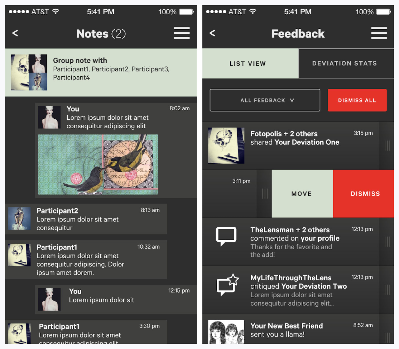
Key activity: Design key screens and patterns. MVP features included new ways to view and upload art, redesigned user profiles and a core set of social interactions from favoriting to posting comments.
Even this limited feature set required many screen templates and workflows. My team focused on navigation, interaction patterns and key screen templates. We collaborated closely with DeviantArt's internal team, so that they were well positioned to finalize design across all screens and develop and iterate the app.
Key activity: Consult on a high-fidelity prototype. Building on the key screens, DeviantArt developed a high-fidelity prototype across the full set of screen templates. I regularly met with the DeviantArt team while they developed the prototype, reviewing ongoing work and helping to solve new design challenges.
Outcome: A successful launch and ongoing iteration. When the app launched in 2014, it reflected the initial vision, and—with millions of downloads and a lot of feedback—DeviantArt was well positioned to improve the app over time.

