Project summary
I redesigned a large legacy website to be clear and focused, useful for community members and able to grow coherently over time.
My favorite aspects of this project included extensive user research, sharing progress with the community along the way, and creating a design system to be a foundation for iteration.
Role and team structure
UX lead at a design agency with a cross-functional team of strategy consultants, writers and UX and UI designers. I also worked closely with client stakeholders to review research, critique designs and hand off completed work.
Key activities
- Prepare and conduct qualitative user research
- Synthesize findings into personas, journey maps and requirements
- Lead design for information architecture and wireframes
- Oversee junior UX designer
- Present to client stakeholders and leadership

The Internet Society is a global nonprofit organization, founded in the early days of the Internet, that promotes an open, globally connected and secure Internet.
Moving Brands worked with the Internet Society to help the organization articulate their vision and goals, refine and extend their identity, and better understand their members.
A key outcome from the work was a redesign of their website.

Challenges for a new website
The Internet Society's website was first built in the 90s and grew organically over decades. This led to several challenges and considerations for redesigning the site. These included:
Challenge: Sprawling content. The website had over 30,000 pages, with inconsistent design and cluttered navigation. The site had valuable information, such as scholarships and maps of Internet usage around the world, but it was hard to find what you needed.
Challenge: Diverse user needs. With a global membership and the Internet facing very different challenges in different places, the Internet Society’s work is inherently complex. Depending on a local community’s needs, members might build physical infrastructure to enable faster and cheaper Internet access, provide scholarships to young engineers, or advocate to protect online privacy. Relevant information and tools varied widely between users.
Key requirement: Involve the community. Like the kind of Internet it works for, the Internet Society has a collaborative, consensus-based culture. It was important that community members were aware of and could be involved in any significant changes.

Approach: Research and design in the open
Because it was important for the community to be part of the design process, research was a way for us to learn about the community and for the community to learn about the project.
Key activity: Qualitative user research. We spoke in depth with over 30 staff members and community leaders around the world. This ensured global representation and gave members an opportunity to become informed and make sure we heard their viewpoints.
Key activity: Regular updates and feedback. We used the organization’s member portal to share surveys and work-in-progress and to request feedback. Staff members facilitated conversation on discussion boards and email lists. The site also launched in beta for several months, so that community members could to review it before it went fully live.
Design outcome: Research-informed priorities. We synthesized research findings into user personas, journey maps and priorities for the site’s information architecture. Ongoing feedback informed course corrections throughout the design process.

Design direction: Simplify and support growth
Key user needs that we identified included:
- Focus on action. Emphasize what the organization achieves and invite participation.
- Simplify but don't oversimplify. Balance helping users find what they needed with the diversity of those needs. The site had to serve users ranging from members looking for volunteer opportunities, to engineers installing infrastructure, to policy experts writing briefs.
- Accommodate growth. Incorporate existing content (the site had 20 years of Internet history that shouldn’t be lost) and build systems that enable coherent growth other time.
This guided design for the new site, for example:
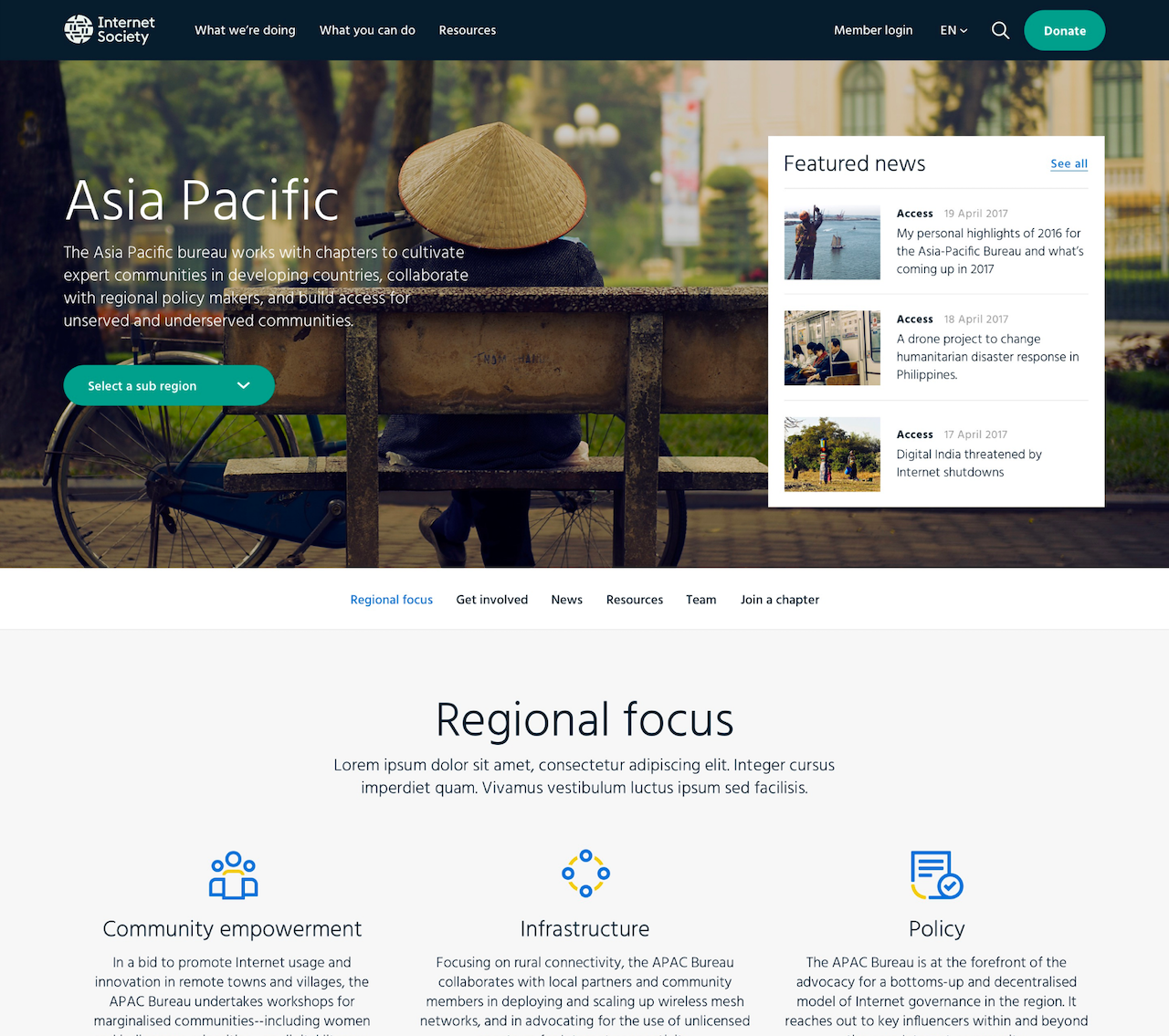
Design approach: Streamlined navigation. The new navigation focused on two entry points – “What We’re Doing” and “What You Can Do” – supported by resources. This emphasized the organization's actions and impact and made it easier for users to find specific ways to get involved. Other entry points, such as learning about the organization, were available but lower priority.
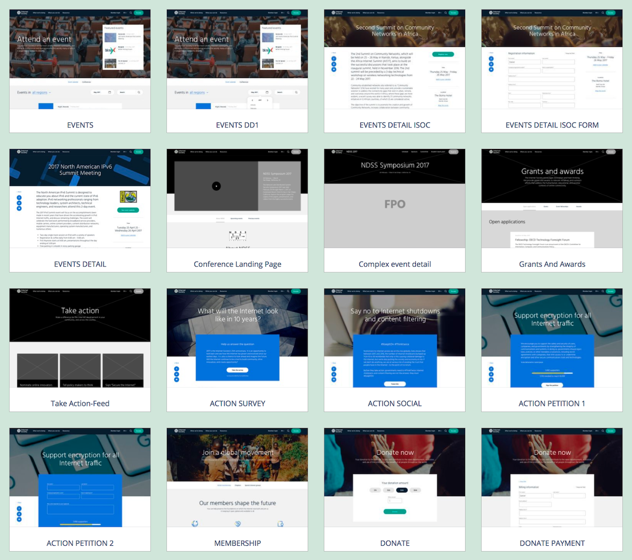
Design approach: Modular patterns. We established flexible and modular design patterns that incorporated clear calls to action and connections between related content. This gave a starting point for adding to and changing the site without losing coherence or action orientation.


Outcomes and learnings
The new site launched in 2017. Five years later it has evolved substantially, but many of the patterns we established are still in use. Most importantly, it still has clarity in purpose and action.
This project was one of the reasons I started working with one company long-term, rather than with an agency. While I think we set a good foundation, it felt like my work was incomplete. The real test would come over time, as people used and changed and added to the site, and I realized I want to see through that whole process, not just the beginning.

